The Fall Palette Everyone Will Be Copying This Season

There is a particular alchemy to autumn light — the way it turns everything slightly amber, slightly slower, slightly more forgiving. The best fall interiors don't fight that light; they're built for it. This season, the palettes coming out of the design world's most influential studios move away from the predictable pumpkin-and-cinnamon clichés of seasons past and toward something moodier, richer, and considerably more grown-up.
Here's where the color story is heading — and how to bring it into your own rooms without it reading like a costume change.
1. Burnt Terracotta Is Having a Renaissance
Forget the flat, matte "pumpkin spice" orange of years past. This season's terracotta is deeper, dustier, almost bruised — closer to a Tuscan rooftop at dusk than a craft-store mum. Designers are using it on plaster walls, on the backs of dining chairs, and increasingly on kitchen cabinetry, where it reads as warm rather than trendy.
How to use it: Skip the accent wall. A single lacquered terracotta door, a set of ceramic table lamps, or reupholstered dining chairs deliver the same warmth without dating the room in five years.
2. Deep, Almost-Black Greens
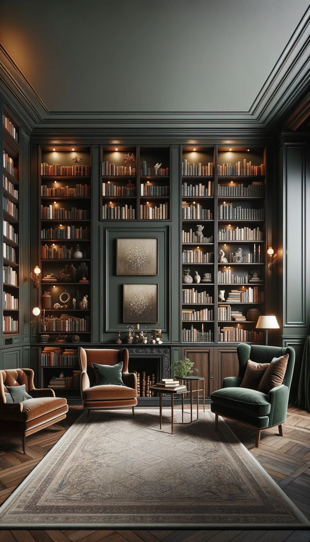
Hunter green is out; something closer to a bottle-green so dark it reads as near-black in low light is in. Think library walls, not forest cabins. It's showing up heavily in boucle sofas, velvet drapery, and cabinetry — paired with warm brass or unlacquered hardware for a look that feels more London townhouse than New England farmhouse.
How to use it: This color wants contrast. Pair it with warm wood tones, cream linen, and soft brass — never with cool white, which flattens it into something closer to hospital scrubs.
3. Saturated, Egg-Yolk Gold
Mustard is dead; long live true, saturated gold — the color of a poured glass of Sauternes. It's appearing as a single statement piece: a velvet accent chair, a set of glassware, a hand-thrown vase. Used sparingly, it reads as luxe. Used everywhere, it reads as 1974.
How to use it: One piece per room, ideally something with a soft, reflective finish — velvet, brass, or glazed ceramic — so it catches the low autumn light rather than absorbing it.
4. Warm, Chalky Neutrals Replace Cool Grays

The greige era is quietly ending. In its place: warmer, chalkier neutrals with a whisper of pink or clay underneath — think unbleached linen, wet sand, or aged plaster. These are the walls designers are using as a backdrop specifically so the terracotta, green, and gold above can do the talking.
How to use it: If you're only making one change this season, repaint your trim and walls in a warm white with a hint of pink or ochre undertone rather than a true cool white. It's the single most transformative, least risky move in this entire palette.
5. Espresso and Walnut, But Matte
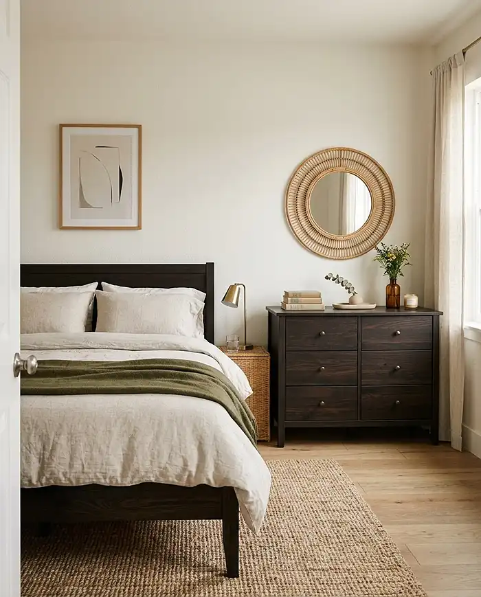
Dark wood is back, but glossy dark wood is not. This season it's matte-finished walnut and espresso — on dining tables, on floors, on kitchen islands — paired with lighter stone or linen to keep it from feeling heavy.
How to use it: Introduce it through furniture rather than finishes if you're not ready to commit — a single walnut console or coffee table does the job without a renovation.
Two swatches worth pinning to your mood board:
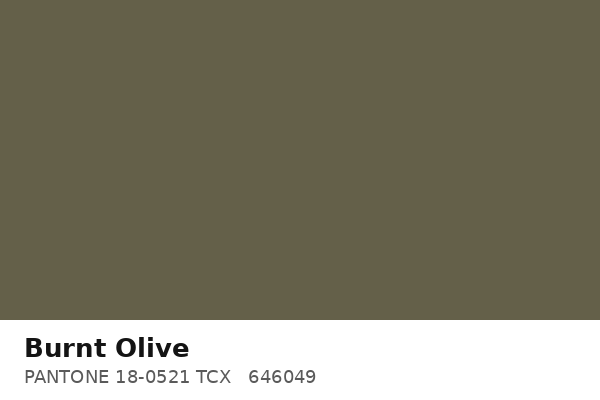
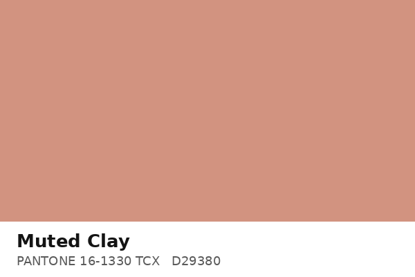
Rounding out the report are five seasonless neutrals — the backdrop every hue above is styled against on the runway, and they translate directly to wall color:
| Pantone Name | Code | Reads As |
|---|---|---|
| Egret | 11-0103 TCX | Creamy winter white with natural warmth |
| Candied Ginger | 15-1213 TCX | A smooth, soothing warm neutral |
| Toffee | 18-1031 TCX | Timeless chocolate brown |
| Underworld | 17-4005 TCX | Mid-tone grey with quiet strength |
| Poseidon | 19-4033 TCX | Deep midnight blue |
The Takeaway
The through-line across every one of these colors is restraint dressed up as richness. Nothing here is loud. The palette works because each color is deep enough to feel intentional and warm enough to feel lived-in — a far cry from the literal, seasonal decorating of years past. Choose one, maybe two, and let the room's materials — linen, brass, plaster, walnut — do the rest of the work.
Next in the series: the fall furniture silhouettes designers are actually buying this year — and the kitchen trends replacing all-white everything.
www.savinoteam.com
Laurie Savino
Real Estate Associate Broker
The Corcoran Group
Comments ()